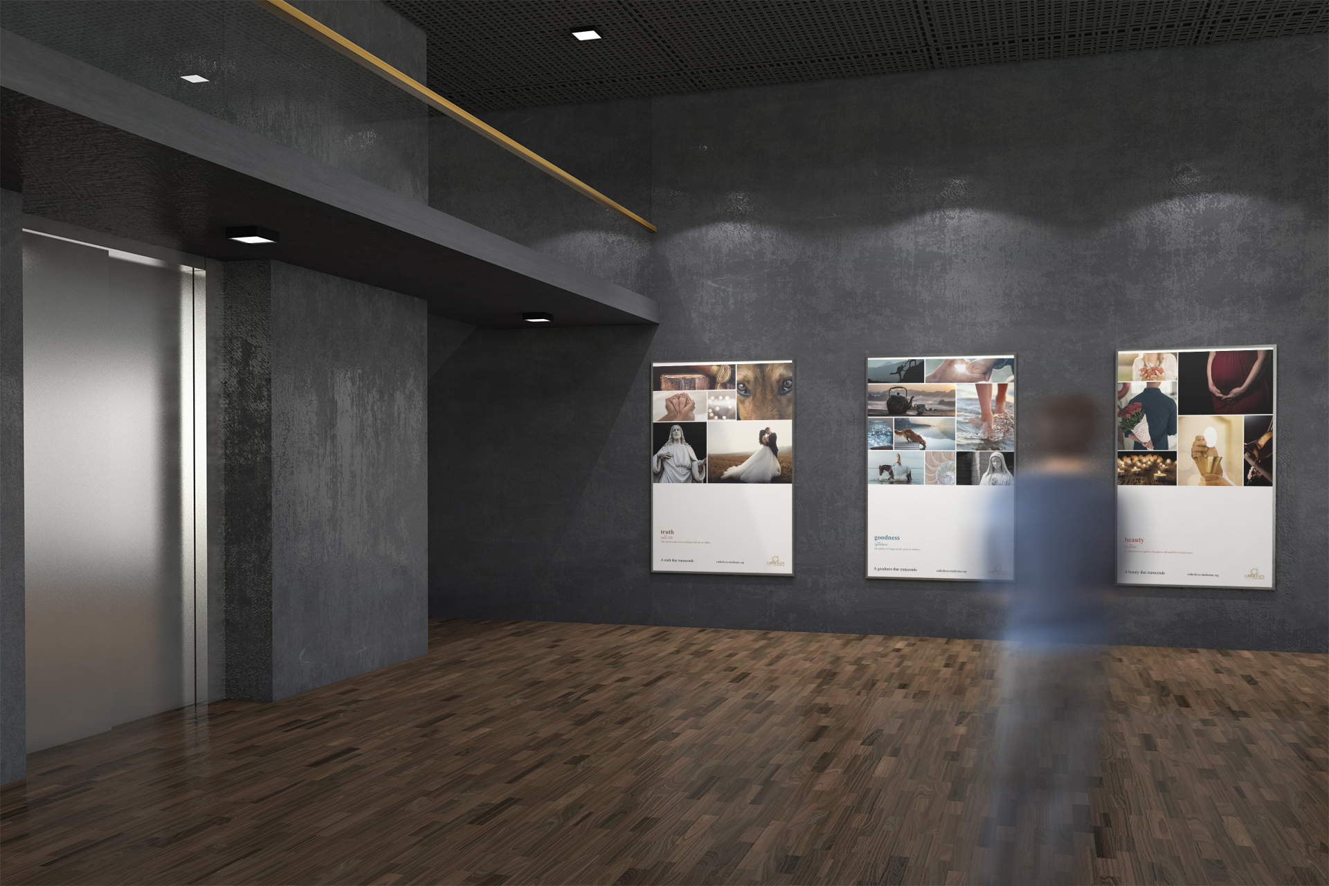
Transcendental Triptychs
Truth, Goodness, and Beauty. There is not much more that needs to be said but so much that needs to be understood. These posters are meant to be looked at slowly. I aimed to show elements of faith, hope, and love within each poster.
Sketches
I started out with many thoughts and ideas for this project. They ranged from the created, natural world to classical art and the my faith in general. Ultimately, I selected the definitions idea but it needed more, so much more that nothing could express what I was trying to say except something multifaceted. I needed layers of idea. That’s where that grid I’d been struggling with for years finally gave me wings and became my friend.


Color
Color is crucial to this project. Truth is real and the earthiness and warmth of brown make it palpable. Goodness can be seen in the coolness of the backdrop of the blue ocean with white foam. Beauty is there in the most important parts of our lives. We see and feel it with the heart and with love, symbolized by red.

Typography
Definitions are something basic. Without the understanding of a word we cannot use it correctly in a sentence or communicate clearly. I wanted to use the most basic and fundamental font I could think of for the definitions of my words. Beautiful photos need a plain and basic backdrop to frame them. Times New Roman provides just that.

Early Digital Designs
These original versions include a grid that is the same size and shape throughout the series. This was changed in the final in order to create more visual interest. The typography was large here but was later reduced in order to create more white space that allows for deep thinking.


Final Versions
In these final versions the grid is unique in each composition. Each poster contains it’s own color palette yet the similar patterns of the size of the photo area and the placement of the typography give a predictable format that draws them together into one series. The type is small intentionally to draw the viewer’s attention and make them look more closely. The white space is large to allow for contemplation.


Environmental Contact